Experimental Jetset, Trash and Sushi
Oh hi, you're still here? Don't you have anything better to do? No? Ok, I'll try to start posting regularly again.
I've been getting more and more interested in graphic design since I started working in publishing. I've always been fascinated by signage and things like that, but I've really started becoming more actively interested in the theory behind design from a marketing and aesthetic perspective. So much so that I've started seeking out books by Edward Tufte, despite his hated of PowerPoint. Which is not inherently evil.
As part of this newfound interest, I recently Netflixed a great movie called "Helvetica." I meant to check it out when it screened a couple of times in Chicago, but never got around to it. Yeah, yeah. A movie about a font. But it really is an interesting overview of modern and postmodern graphic design. And how both designers and consumers, for lack of a better word, react to visuals, especially the presentation of the written word.
I'm a pretty huge fan of helvetica the font. Despite it's ubiquity, I'm a big fan ofthe modern look and the clean lines, and use it as my standard presentation font. The film does a great job of outlining the history and development of helvetica from the Swiss school of design to becoming a major corporate style in U.S. advertising and marketing. The anti-corporate reactions to helvetica are pretty interesting, with one designer semi-jokingly saying that it was responsible for the Vietnam War. These reactions, along with the influence of drug and music culture on the design world, influenced a move to more freeform, hand drawn typeface and design. And eventually to so-called "grunge" design, typified by Raygun Magazine.
I always had a love/ hate relationship with Raygun. Copies would show up in the mail when I worked in a library periodicals department, despite us not having a subscription, and would usually find its way home with me. The unreadability sometimes drove me nuts, even if it did look cool. In "Helvetica," the editor of Raygun tells a hilarious story about receiving a very cliche, and not very good, article about Brian Ferry (which probably mentioned repeatedly how suave he is and that "Avalon" is a great album), and running it completely in wingdings to make a point about the disposable quality of the writing.
{pretentious attempt to write in wingdings thwarted by Blogger}
But since all things are cyclical, reaction to the over-the-top nature of the more cluttered style led to a return to the helvetica-based, cleaner design done best by the super cool Dutch firm Experimental Jetset. Anyway, check out "Helvetica" the film if you are remotely interested in graphic design or good documentary film making in general.
There are some bands I like to name check, and one of them is Pavement. But I've never been a huge fan of Stephen Malkmus solo for some reason. So I'm pleasantly surprised that I'm digging his new album "Real Emotional Trash." Nice random lyrics and delivery backed by some interesting languid, jazzy stoner rock. Good guitar solos too. And one section of the title track has a definite "LA Woman" vibe. Not too shabby.
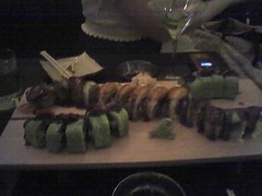 This week's consumable is sushi. Tasty, tasty sushi. On Saturday evening I went to a great sushi place called Tank in Lincoln Square. They do sushi the arty way, with interesting ingredients, flavor combinations, and presentation (follow the Flickr link for specifics). I think I still enjoy Tanoshii better for high end sushi goodness, but Tank is worth trip. And the perfect start to a square dance evening in excellent company.
Labels: food, graphic design, music
posted by David @ 10:56 PM
0 comments
![]()

0 Comments:
Post a Comment
<< Home